A Reception Table

A reception table is the first thing that comes into your eyes when you enter a company, gallery, hotel and etc.
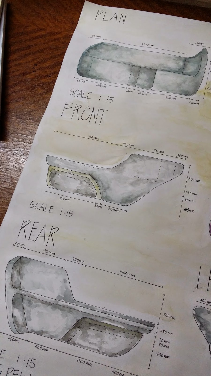
It could bring out the identity of the company and give a welcoming sense to the visitor.
Therefore, a reception table is very important.
For this task, I chose MoMA (Museum of Modern Art) as my design target.
I like MoMA very much and it would be my greatest pleasure if I could design a reception table for MoMa.
MoMa is an art museum in Midtown Manhattan in New York City. Its collection offers an overview of modern and contemporary art.
This inspired me to design a sculptural reception table that suits MoMa's image.
The reception table was named as 'Ospiral' which means organic shape of spiral.
The design was inspired by an element 'spiral' which is popular in architecture, art and nature. 
I could see this element appears in a french curve and nautilus shell.
I transformed them into an organic form and this is how 'Ospiral' is formed.
To make the design more functional, I added a chair which could be hidden below the reception table.
It could be pull out for visitor to have a comfortable conversation with the receptionist.
The material for the chair is polypropylene so that it is light and easy to be pulling in and out.
For the reception table itself, I chose quartz as manufacture material due to its properties like durable, resistant to dirt, extremely hard, scratch-resistant, easy to clean and hygienic.

\


[It is okay to dream big. Sometimes it is dream that boost you up]

Comments

Popular posts from this blog

Let's Learn About Architectural Lettering If You Want To be A Designer

First Lesson In Design Class: Learn How To Write A rchitectural Lettering If you think the first lesson in design class is something about design theory/ philosophy or probably some sketching, you are definitely wrong! If you want to be a designer or architect, your handwriting couldn't be sucks!  First of all, practice your handwriting, not freehand writing, but architectural lettering. Eventhough our drawings nowadays depend on AutoCad and some other softwares, in the past designers were drawing manually and therefore neat handwriting is crucial. Maybe You Will Be wondering: What Is An Architectural lettering? It is expected as a designer or architect that all blueprints, drawings and designs have architectural lettering. This lettering was established ages ago by architects so that all writing on blueprints were legible therefore costly mistakes would not be made. Practicing this lettering is still a necessary part of the curriculum in most architectu

Presentation Drawings

This is something I never expected. Blueprint,  a technical drawing that acts as a plan or model.  It documents an engineering or architecture design. Examples of blueprint: I need to draw the blueprints of 'THE HEXA' that I had done in the previous project! It is a very tough job as the design is quite complicated. Gotta pull up my socks to finish the project in time. Plan, front, rear, left and right view Two point perspectives to draw out 'The Hexa' with a human figure to indicate the scale                 Axonometric Drawing- isometric which is in 30 degree elevation Colour with Alpha Water Colors PS: I made mistakes in the drawing: the furniture should have some thickness to indicate its volume.  It is learning process anyway. [Practive makes better] -End of chapter-

Mind Maps, Mood Boards, Conceptual Models, Renderings

Back to second year. Unlike the first year where all the newbies studied the same courses together, we were separated into our majors in second year. Mine was interior design. Well, a brand new year. We moved to second year interior design studio (a small studio just to fit 20 persons) and we got new studiomasters! (as we have our studio project as the main subject, we called the lecturers as studiomasters, masters who lead the studio) So, how to start a design? Do mind mapping. Take a subject and start to elaborate about it. The core is to think.  After brainstorming, choose three design elements and principles that could make the design works. Design elements: point, line, shape, form, space, color and texture. Design principles: balance, proportion, perspective, emphasise, movement, pattern, repetition, rhythm, variety, harmony and unity. A simple example: start with flower as the subject, we can elaborate into colour (design element), organic shape(design element),