Neighbourhood Elements

Neighbourhood elements are about site analysis and improvement proposal.
We are given six new developed neighbourhood areas as following:
Bayan Residences, Relau, Penang
Sunway Mutiara, Batu Maung, Penang
Sunway Bukit Gambier, Penang
Siara 81, Sg. Ara, Penang
Sunway Merica, Sg. Ara, Penang
Setia Greens, Sg. Ara, Penang

I chose Siara 81 as my analysis target. Since it is quite far from USM campus, I went together with my friends in group.
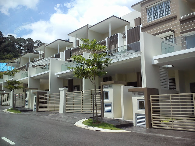
Property project : Siara 81
Location             : Sungai Ara, Penang
Property type     : Two-storey terrace( 75 units), two-storey semi-detached ( 6 units)
Developer          : Iconic Properties Sdn. Bhd

Terrace type
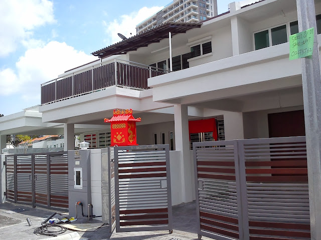
Semi-detached type
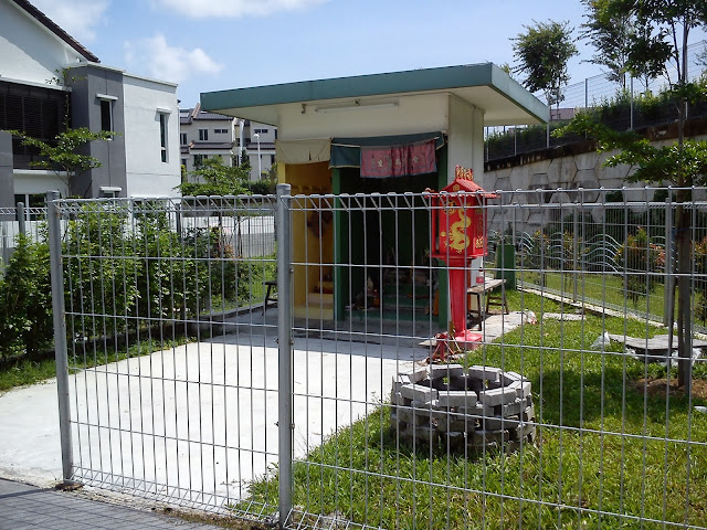
A small temple in the neighbourhood
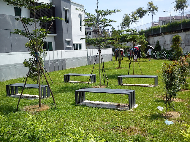
Open space
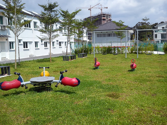
Playground

Analysis is presented graphically.
Some important features: Location plan, key plan, site plan, scale, sun path, direction of prevailing wind, legend and facilities provided around the area.
Based on some interviews with the residents, the neighbourhood area receives sufficient amount of sunlight and wind blow. There is a secondary forest  for residents to have a walk and get closer to the nature. The surrounding is quiet. It is very suitable for people who want to have a quiet and peaceful living space. Therefore the planning of the area is considered successful.

I proposed some improvements after observing the neighbourhood area.
There should be a neighbourhood center where residents can gather for activities like meetings, events and other community activities.
Besides, the landscape of the neighbourhood should be improved by planting more trees and flowers.
This could give a more aesthethical view and create a sustainable green environment.
Other admendments includes fountain at roundabout, recycling bins, picnic sets, lamp post, book booth,drainage cover and modern fences.

                                                   
-End of chapter-


Comments

Popular posts from this blog

Let's Learn About Architectural Lettering If You Want To be A Designer

First Lesson In Design Class: Learn How To Write A rchitectural Lettering If you think the first lesson in design class is something about design theory/ philosophy or probably some sketching, you are definitely wrong! If you want to be a designer or architect, your handwriting couldn't be sucks!  First of all, practice your handwriting, not freehand writing, but architectural lettering. Eventhough our drawings nowadays depend on AutoCad and some other softwares, in the past designers were drawing manually and therefore neat handwriting is crucial. Maybe You Will Be wondering: What Is An Architectural lettering? It is expected as a designer or architect that all blueprints, drawings and designs have architectural lettering. This lettering was established ages ago by architects so that all writing on blueprints were legible therefore costly mistakes would not be made. Practicing this lettering is still a necessary part of the curriculum in most architectu

Presentation Drawings

This is something I never expected. Blueprint,  a technical drawing that acts as a plan or model.  It documents an engineering or architecture design. Examples of blueprint: I need to draw the blueprints of 'THE HEXA' that I had done in the previous project! It is a very tough job as the design is quite complicated. Gotta pull up my socks to finish the project in time. Plan, front, rear, left and right view Two point perspectives to draw out 'The Hexa' with a human figure to indicate the scale                 Axonometric Drawing- isometric which is in 30 degree elevation Colour with Alpha Water Colors PS: I made mistakes in the drawing: the furniture should have some thickness to indicate its volume.  It is learning process anyway. [Practive makes better] -End of chapter-

Mind Maps, Mood Boards, Conceptual Models, Renderings

Back to second year. Unlike the first year where all the newbies studied the same courses together, we were separated into our majors in second year. Mine was interior design. Well, a brand new year. We moved to second year interior design studio (a small studio just to fit 20 persons) and we got new studiomasters! (as we have our studio project as the main subject, we called the lecturers as studiomasters, masters who lead the studio) So, how to start a design? Do mind mapping. Take a subject and start to elaborate about it. The core is to think.  After brainstorming, choose three design elements and principles that could make the design works. Design elements: point, line, shape, form, space, color and texture. Design principles: balance, proportion, perspective, emphasise, movement, pattern, repetition, rhythm, variety, harmony and unity. A simple example: start with flower as the subject, we can elaborate into colour (design element), organic shape(design element),